If you’ve been following along the past few months of Ulysses updates, you may have realized a serious shift in gears: We are now releasing a much more constant stream of updates, some small, some large, some with mere bugfixes, and others with a mixed bag of cool new stuff, that would never have warranted a full version jump in the past.
When we switched to subscription earlier this year, this new way of doing updates was a huge internal driving force. We no longer wanted to be restricted by big X.0 releases gaining lots of attention, but instead wanted to be able to react faster to OS & device changes, and also to deliver major new features once they were ready (instead of waiting for a bunch of them to pile up).
It’s a very relieving change for a company (and product) that is, and always has been, rather design-heavy — we’re trying to make the complex look easy, after all, so a lot of Ulysses’ power needs to be presented as subtly as possible, which is in stark contrast to how we needed to market updates.
You may also have noticed how we have begun redesigning various aspects of the app — the library in v12, the image, link and footnote editors in v12.1, etc. –, and you may have wondered why this has happened one step at a time, instead of all at once.
Today, I’d like to offer some insight into our thinking and hope to deliver some background to all the recent changes we made in the app. This post will outline and discuss our main design guidelines, and as such is mainly a design post, not least because it’s written from a designer’s perspective — mine. It’s also bound to get a bit theoretical at times, but I still hope it’s interesting enough for some of you.
The List
There are currently five design guidelines for Ulysses:
- Stay on top of Apple‘s releases
- Reduce redundancies
- Improve existing interactions
- Add new features
- Innovate
There’s another guideline, which is more of an overall theme, and which was made possible by our move to subscription: “One step at a time.” I won’t elaborate on this too much, but we believe this to be the only sensible way for software to go into the future. Monolithic releases are the dead end they have always been, only now everybody’s much, much further down the blind alley…
Ok, then.
Staying on Top of Apple’s Releases
Apple is currently releasing OS & device updates at a blistering pace, and the adoption rate of these new releases is simply staggering. Making Ulysses feel at home on Apple’s stuff is a top priority, and lagging behind in this regard is not an option.
Now, contrary to popular belief, in order to “stay on top” it’s not enough to attend WWDC and get early access to the OS betas. As an example, while iOS 11 was introduced at this year’s WWDC, iPhone X was not. Yes, we saw the large headers and some demos, but there is so much iPhone X influence in iOS 11’s design changes, which was just impossible to grasp before iPhone X was shown.
But as a designer, my main task is not to ask how stuff looks, i.e. which font sizes did change, or which dimensions certain elements have grown to — but rather ask why it looks as it does. I need to understand the underlying principle whenever changes happen, or else I’m just assuming paint jobs. This is also important to try and anticipate future changes (or rather: a direction), so that the work done today won’t feel obsolete tomorrow.
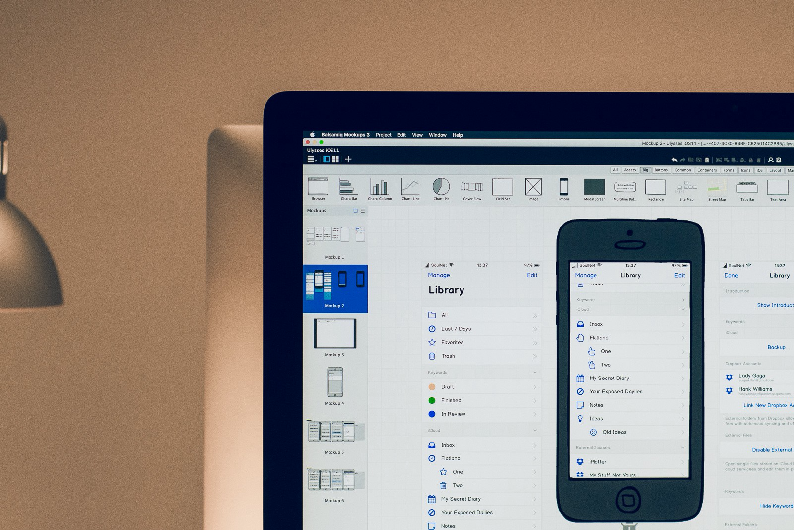
And it’s not just optics and a brand-new phone, either. iOS 11 added fundamental features, such as improved multitasking and inter-app Drag and Drop, both of which are essential for an app such as ours, which is destined to be used in conjunction with Safari, OmniOutliner or MindNode. Drag and Drop alone required us to completely redo the library, which then meant redoing multi-pane editing, which in turn required changes to the editor.
The result is a fresh new look for Ulysses, built for iOS 11, optimized for iPhone X, ready for any type of split screen, and based around patterns found in Apple’s Music & Podcast app, the new Files app, and the relaunched App Store. Throw in some additions from Maps and Messages, and you may rebuild what we have here — a perfect citizen to its host OS, a permanent resident, and one who’s come to stay. Make no mistake though: This is work. ;)
Reducing Redundancies
There’s a certain catch-22 when adding features to Ulysses, and that has to do with our “minimal” approach over new and important features: How do you keep adding without bloating? How do you keep it simple while adding power? How do you change things while keeping the basics intact? Ulysses has grown quite a lot over the past few years, and while we certainly managed to keep bloat and version-shock to a minimum, some cracks started to show.
Essentially, we were offering too much power at too many places without placing that power front and center. The result were a lot of hidden (or at least obscured) features which showed up in lots of places, just to ensure the user would find them… somewhere.
With Ulysses 12, we have started to crack down on these redundancies. We’re still a productivity app, so we can’t eliminate every instance of a repeating feature, but as a rule of thumb, we now consider “will require a second tap” to be the better alternative to “is also available here”. This streamlining is a pretty painful process, though; we never implemented stuff lightly, so removing a button from location X is always accompanied by huge discussions concerning user expectation and reaction. It has enabled us, however, to look for better alternatives, i.e. rethink the original way of doing things and try to come up with better solutions.
You can see the first results of that process throughout the library (now fully unified), within the sheet table (e.g. swipe actions), and inside the editor (the new element editors, the keyboard row arrangement), among other places. The next updates and features will strongly push in the same direction — expect a lot of subtle and not so subtle changes to attachments, goals and keywords, which we hope will further reduce friction while adding even more possibilities.
Improving, Adding, Innovating
Since Ulysses is an evolving product, we are always looking at fine-tuning what we already have, regardless of more fundamental changes in the background. And obviously, we are also looking at adding new features whenever we see fit, or because they are on our rather long backlog.
However, none of these points must be allowed to take over development and direction on its own. None of these points must be allowed to take precedence, to be the end to its own means. A new feature must fit in, and improvements must make sense in light of the bigger picture. And innovation may be imperative to stay ahead of the pack, but we must not innovate for the heck of it, just because, or else we’ll end up with Mac-like menu bars in iOS apps.
Also, on a technical level, each change, each addition, each new feature is usually very involved, because Ulysses is such a complex and grown-up app. If you look at one of the most requested features, say tables — it goes well beyond a mere table editor. Not only do we offer various export formats with varying styles, we also offer a certain “editing comfort standard”, which we don’t want to undermine. We can’t just let you do |this|that|some|more|, because this wouldn’t be Ulysses, it wouldn’t be us. So we can’t “just put it in”.
On the other hand, we must not allow ourselves to stagnate, but instead go and take Ulysses to new heights, as neither our users nor our competitors are standing still.
So these three points — improve, add, innovate –, as obvious as they may seem, are both our main building blocks and our main sources of reflection. Yes, improve. Yes, add and innovate. But not at all cost. Make it fit in perfectly. Do it… right.
One Step at a Time
We are now in the lucky situation to have completed our switch to subscription. Our subscribers are the ones that will keep us running, and so we are no longer hard-pressed to release monster updates to gather attention and grow our user base. We can instead add constantly, improve steadily, and even iterate more easily — our focus has shifted from future users to current users, after all.
Think what you will, but this is huge. As outlined above, our mission to make Ulysses as powerful as possible while still keeping that minimalistic approach is quite demanding. Some features go through the whole process of concept, design and production, only to be scrapped or get redone in full, because the outcome didn’t work the way we expected. We want to maintain this freedom of saying no, because it’s what makes a great product — saying no. Saying no to bad ideas, of which we have… a lot. We iterate a lot, we throw away lots of stuff, because, quite frankly, lots of the stuff we do has never been done before, we need to try and test… it’s classic R&D, basically.
We had to learn this new way of doing things, of single steps, or rather that new way had to conquer us. If you have been releasing large updates for 13 years, it’s quite hard to abandon that mindset. At first, it feels as if you’re not doing enough, as if you’re no longer able to meet expectations, to wow users.
I’m happy to tell you that we have been successfully conquered now. Which is… really… cool, really. :)
What’s Next?
We have been asked to deliver some sort of road map, and while I can’t offer a definite outlook (because things change, you know), I can at least tell you what we’re working on right now.
Keywords: One of the next versions will see the addition of a keywords section to the library, and also allow for colored keywords and tagging via Drag and Drop. Long in the works (I believe we started two years ago).
Daily Goals: A feature we wanted to have available for this year’s NaNoWriMo, but iPhone X ruined everything (in a good way). This will be wrapped into a major update to goals in general.
Attachments: The attachment bar will see a rather significant update in one of the next versions. It has been neglected for far too long, and we will finally address several issues such as reordering and… almost… everything. ;)
Code Blocks: Yeah, we know. But we’re on it, believe it or not. Our switch to subscription took longer than expected, plus iOS 11 and iPhone X happened, so we had to postpone this one… once again, yes, yes.
Styled Export: We have been working on a new export engine for PDF for several months now, based on user feedback and feature requests, and while it’s not finished yet, it’s one heck of an engine already. As with everything on this list, I can’t go into details or specifics or ETAs etc.
So… this is Ulysses: Moving Forward. I understand that this post is rather iOS-centric, but since we had to do a lot of catching up to do on this front, it shouldn’t come as much of a surprise. That list, though — that’s cross-platform. It’s the good stuff. Expect no less.
Have fun.
This article was first published on Medium.