In our series of Ulysses 22 quick tips, we want to introduce some of the smaller features in the latest release, and explain how they can benefit your writing workflow.
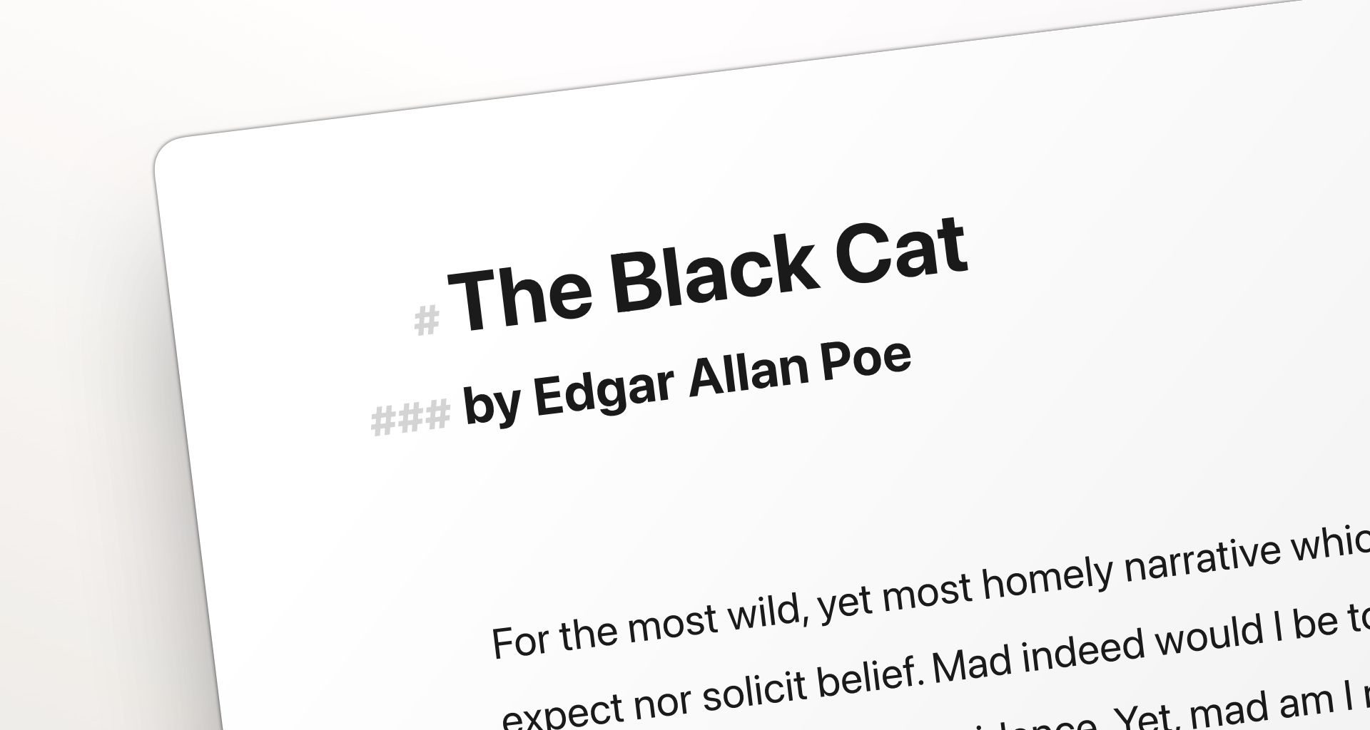
Do you want your headings to clearly stand out from the rest of the text, so you can find them faster? Or should they do the opposite, and blend in with the body text, so they don’t distract you? You can do both and anything in between.
With Ulysses 22, the size of your headings became a new setting of your editor theme. The theme defines the background color of the editor as well as the colors of fonts and tags. With the last version, Ulysses received a new default theme: D22. The colors haven’t changed, yet the sizes of headings have, as you may have noticed.
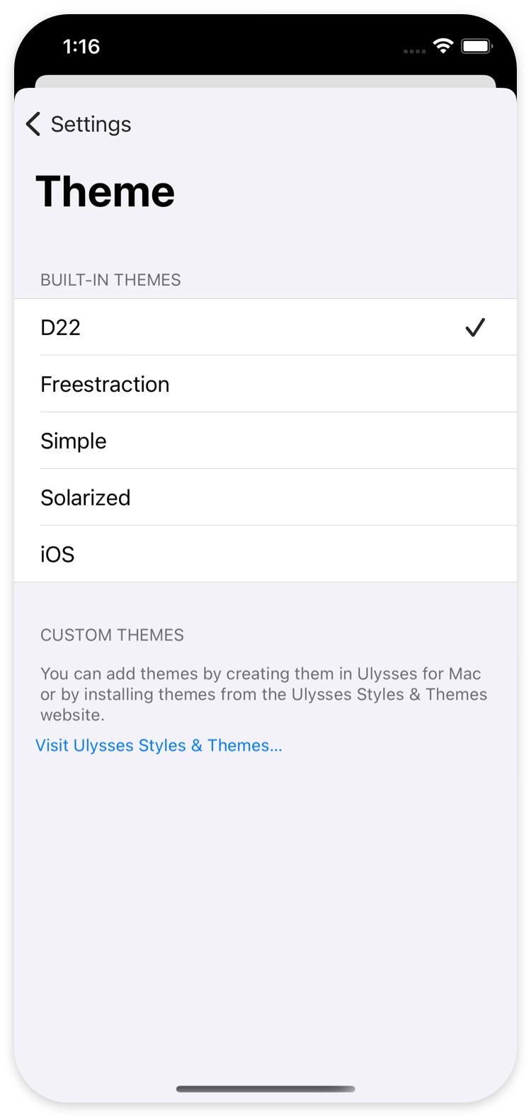
Now, if you prefer small headings instead of the large ones in D22, you can select a different theme in your settings.
On Mac, follow these steps:
- In the Ulysses menu, open Preferences.
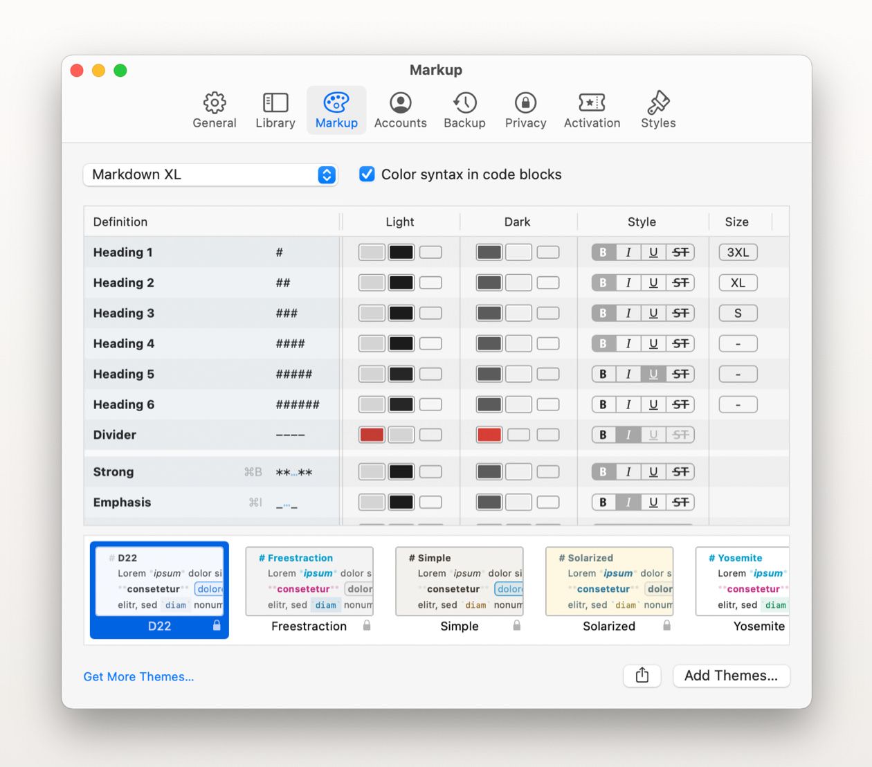
- In the Preferences window, switch to the Markup tab.
- At the bottom of the window, choose a different theme, e.g. Simple.
If you would like to switch back to D22’s predecessor, D21 with bodytext-sized headings, you can download it on Ulysses Styles & Themes.
However, on Mac, you can also change your theme’s heading sizes directly in the app. The table above the theme switcher contains the settings of the selected theme. The right-most column dubbed Size lets you increase or decrease heading sizes from S to 4XL. The size setting is only available for headings.
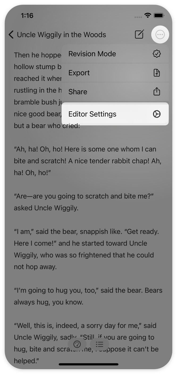
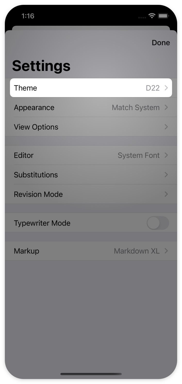
On iPad and iPhone, you can change the theme, but not edit a theme’s settings: Open the editor menu (circled ellipsis), select “Editor Setting”, select Theme... and change your theme.
