Today, we released Ulysses 21 for macOS to the Mac App Store. If this feels like déjà-vu, you’re not far off: v21 for iOS has been out for a couple of weeks now.
macOS Big Sur
Depending on who you’re talking to, the latest version of Apple’s desktop operating system may be referred to as either “Bug Sur” or “Big Sour”, and there are good and bad reasons for this. I think it’s safe to say that this was a rather chaotic release, with pushback after pushback, an absolute void of information (even for Apple), and even at one point a delivery of incompatible dev tools. Our release schedule was put off track a couple of times as we had to come to grips with not releasing iOS and macOS 21 simultaneously.
But whatever, Big Sur is finally here, it’s looking fresh, clean, and Ulysses 21 is more than ready for it.
We took our time and updated almost every single part of the interface to shine on Big Sur. From the library, to the sheet list, the editor and dashboard — nothing was left untouched, and now we probably have the most beautiful text editor in the world. Like… ever.
Revision Mode (Now More Mode-ish)
While updating the UI, we took what we learned from bringing revision mode to iOS, added in user feedback, and decided to move the revision pane out of the main dashboard. Revision mode now has its own button, its own dashboard, and there’s a dedicated “done” button to end the mode
It’s now much clearer what’s happening, if and when checks will occur, and the flow of actually revising your texts should be much improved now.
As with all things new, but with revision mode especially, let us know what you think.
A New Theme
Given how prominent revision mode is in v21 (and given the fact the last theme is 7 versions old, yikes), we thought it was time for a new default theme. So please welcome D21.
Following the… theme (no pun) of this release, D21 is all about focused writing and a dedicated revision run. So we reduced color for standard tags in order to emphasize tags for review. Where color is used, system colors come into play — so D21 is the perfect fit for Ulysses 21 on macOS Big Sur.
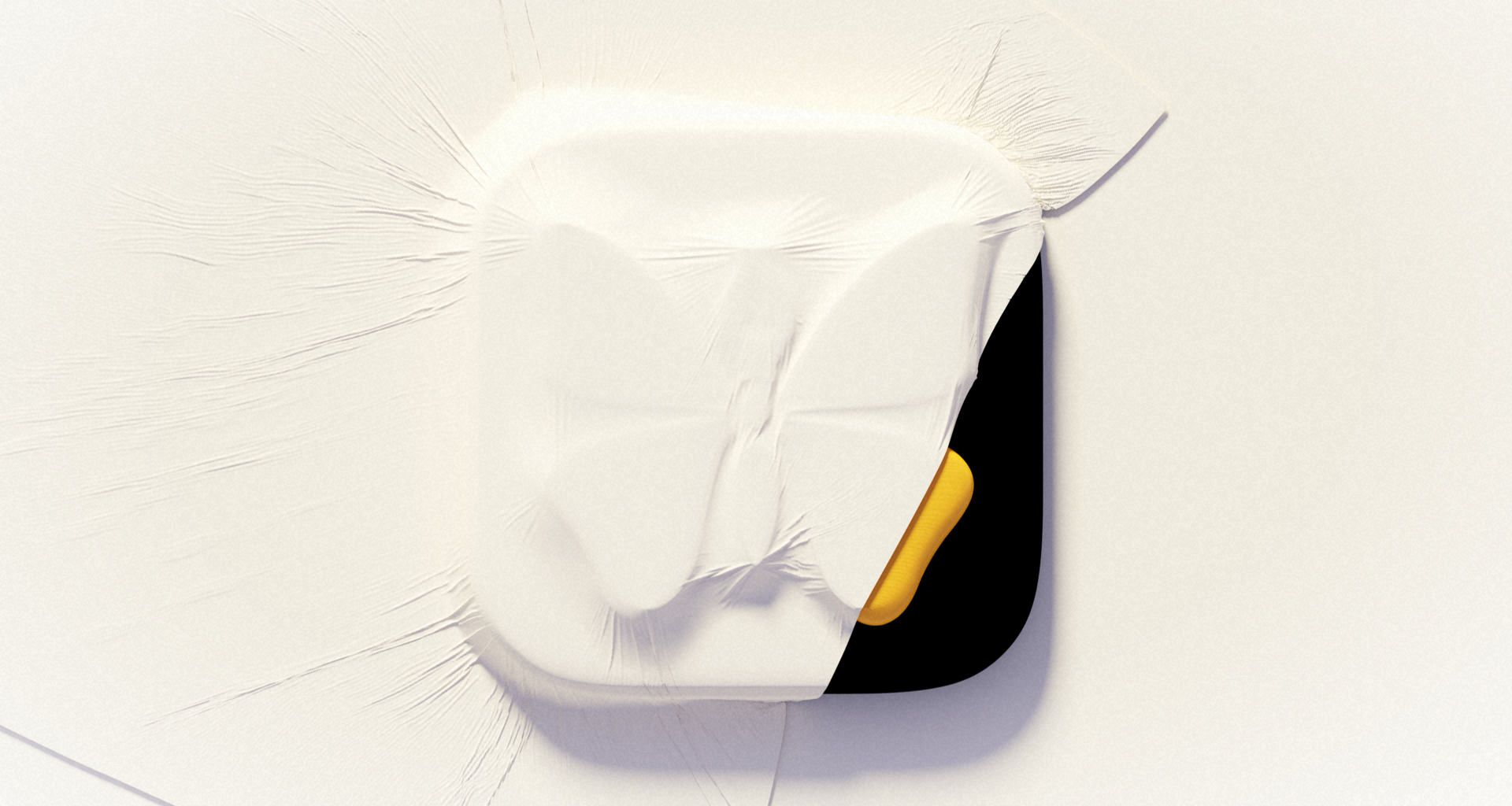
A New Icon
Ulysses 21 sports a new icon, based off of our iOS icon, and it fits perfectly next to all the apps released for Big Sur.
We opted for simplicity here, using our iOS icon as a template, instead of trying something fancy. It’s still fancy, though. ;)
Now we know that for some — users and developers alike —, adjusting to a new icon is harder than adjusting to new features or a new UI. I guess that’s because an icon is the closest thing you get to a physical representation of an app. The icon is “the app”, and its interface is what’s inside. And so changing an app’s icon feels like someone is forcefully redecorating your room or something like that.
We also understand that there’s a strong resistance to the “iOSification of macOS”, and that the simplification of app icons is seen as a glaring example of disrespect for the platform and its legacy.
However, for apps on Big Sur, as on any other system before, we believe that fitting in is the right move, if not the only move, and though they might hurt a bit, and feel strange at first, the new icons throughout Big Sur all look great — by just fitting in. Ours does too.
And that’s today’s update in a nutshell. To learn about all the changes and fixes we integrated in Ulysses 21, be sure to visit our version history. To start working in Ulysses 21 — head to the Mac App Store and update already.
(If you feel like you’ve read that last paragraph before: Again, you’re not too far off.)
As always: Have fun.
(There, did it again)