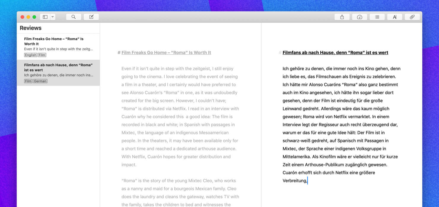
We have just released Ulysses 15 to the App Store and Mac App Store. Go grab it, if you haven’t already; there really is no reason to miss out.
Ulysses 15 features a couple of noticeable enhancements for images, search, and keywords. It also improves usability on several fronts and fixes a variety of bugs. If you‘re curious, you can read up the latest additions in our version history.
What I want to focus on today, is one particular new feature, which we are introducing to the macOS version: “Second Editor”, aka split view. It’s a good example of how we’re thinking with regards to new features, how our emphasis on design affects release schedules, and why sometimes stuff takes longer than anticipated. It also shows how much work actually goes into a seemingly simple feature, even one which, by default, is hidden from view (no pun).
Split View Ramblings
Split view editing has been on our list since day one. In fact, it was available in our very first version (2003, albeit limited to a single sheet), and was only scrapped in the very last minute from our 2013 reboot. So we’re very excited to finally ship a solid split view in Ulysses. And we’re very happy with the way it turned out.
See, split view editing sounds simple enough: Just split the editor in half and load a second sheet, right? Well… let’s be 100% us and ask questions first.
How do you activate split view? Do we offer a button on the toolbar? Or would a menu item suffice?
Split view editing sounds simple enough. Well… let’s be 100% us and ask questions first.
How do you close it? Via the same toolbar button/menu item? Then which side would you close? So do we need a distinct close button on each split?
Is this really a “split” view, or is it rather a “second editor”? Do both editors relate to one another (e.g., master/assistant)? Do we have a “main” editor, or will both editors be on the same logical level? Which editor affects the contents of the attachment bar? Which editor should react to selections in the sheet table?
Since only one editor can have focus… do we need to highlight the active editor in any way? Or will the blinking cursor be highlight enough?
Will the split be movable? How does a non-50/50 split behave on window resize? Do we have a minimum split width? Do we need fixed widths, e.g., 50/50, 33/67 or such?
If we allow resizing, do we need to auto-adjust text size? Do we probably need separate settings for each editor — theme, theme variant, or just view options like paragraph numbers? Does Typewriter Mode affect both editors?
Ok, now… which sheet should load when the second editor is activated? Which editor should be active initially anyway? Do we always open the second editor on the right? What if you have just closed the left split? Do we remember which sheet was loaded when you re-activate the split? May we need a way to swap the contents of the editors?
Do we need settings? Ha.
And most importantly, for me anyway: How can we solve this riddle and a) make the feature obvious, easily accessible and fun to use, but b) do it in an unobtrusive way? In other words: How to implement this elegantly?

Needless to say, we went through a lot of iterations and tests to arrive at what we’ve shipped now. It turned out great, but what a ride it was. Let’s just look at one part: turning the split view ON… and off. What could be complicated about that?
We initially opted for a dedicated “split view” toolbar button. Click it, on, click it again, off. Click and hold, and a menu would pop up, which held a couple of options, such as “horizontal” and “swap”.
However, we soon realized that this was a really bad idea. It put a lot of emphasis on the feature (too much for our taste), and it did a lot of stuff at once (again, too much for our taste): It showed state (redundant, you either have a split view or you don’t), split orientation (redundant when active, irritating when not), and offered options (rather hidden, esp. in fullscreen). It was a mess, so we got rid of it and put split view activation in the View menu.
That of course left us with a lot of settings and no place to put them.
While we were discussing options (main menu, context menu, submenu) we were also busy trying to figure out how to indicate in the UI which editor was active and which wasn’t. This was crucial, because you need to know which editor will respond to changes in the sheet table, and which sheet’s attachment you are manipulating. We already had decided to dim the inactive editor, but we were aware that this had to be optional. We needed an additional way for those times you want two undimmed editors. We tried a lot here, but nothing seemed particularly great — it either was too subtle for a meaningful indicator, too in-your-face, or it was ambiguous, i.e., yes, there was an indicator, but what exactly did it indicate?
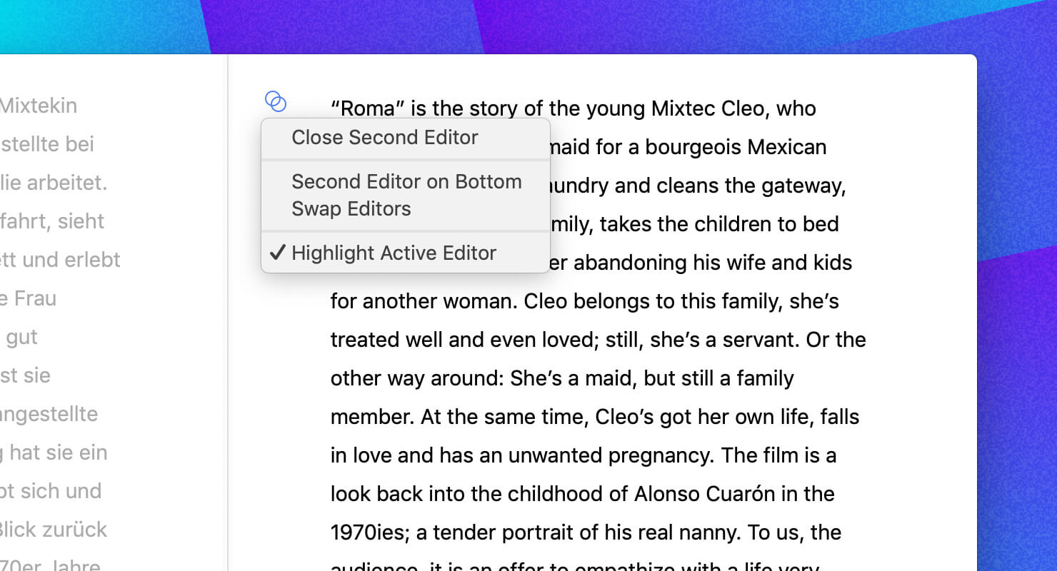
It was such a simple idea, yet a revelation: a split view widget on top of the active editor.
On top, we hadn’t tackled the issue of closing one of the splits yet (we wanted to avoid close buttons). Also, tests had shown that you would use the second editor in two very distinct, almost opposing ways — either for reference or “simultaneous” edits. That’s why most settings/options had to be readily available, but at the same time hidden from view. So we essentially had a working split view, but no acceptable UI, and we were pulling our hair trying to square the circle.
I can’t recall when it hit us, but when it did, it was such a simple idea, yet such a revelation: we introduced a split view widget on top of the active editor.

It’s strange, but that tiny widget solved all of our pending issues. And elegantly so.
First off, it’s an indicator for which editor is active. It appears whenever you activate a split (open, click inside, switch to, etc.), and it disappears when you start typing. It can be forced to show by wiggling the mouse, which is neat, because sometimes you don’t want to click for fear of losing your selection.
It then serves as a menu button, so when you click it, all those aforementioned options appear (split direction, swap, active highlight), as well as a “close second editor” item.
Looking back, I wonder why it took us so long to come up with this because now it seems so dead obvious. I like how it’s really gone when you’re not using the split view, and how it’s “just there” when you need it. I love how it turned that seemingly “simple split view” into something special, something… 100% us.
Yeah.
Most other starting questions were also answered and implemented in an intuitive manner (hopefully). Try dragging the split a bit and resize the window, for example. Now drag the split all the way to either side and resize the window. Ta-dah. Double click the split separator. Ta-daaaah!
And of course you can change editor options such as font sizes and theme variant independently for each editor, and you can use keyboard shortcuts to open, activate and switch editors. It’s all there. Play around a bit.
Just don’t forget to also write.
So we hope you’re enjoying this update as much as we do, split view or not. Be sure to also check out the new keyword filter in sheet table search, its implementation would warrant a full story of its own… ;)
Have fun.
