Ten years ago, the first iPad came to the stores, adding a new dimension to the technological revolution that started with the iPhone. The iPad had a crucial influence on Ulysses' development. Co-founder Max takes a look back.
Ten years ago today, the first iPad was released to the public. As much as I wanted to have one, I had to wait almost two more months until it became available here in Germany. But a few developer friends of mine flew to the US just to get an iPad on the very first day. It seems crazy to travel intercontinentally, just to buy some piece of tech a few weeks earlier than everybody else. To me, it shows just how much excitement there was about this novel device.
The iPad gave a new dimension to the technological revolution that started with the iPhone. If the iPhone showed us that touch is the most natural way to use phones, the iPad was a promise that this concept could be also applied to professional use cases as well. Professional uses like… writing books.
During the past few days, I had the opportunity to reflect about the iPad, how it became a crucial stepping stone in the development of Ulysses. It taught us many lessons, way too many to list here, but I thought you might find a few little anecdotes as interesting to read as I enjoyed recalling them.
The iPad felt so right. We wanted to do a writing app for it.
The first iPad was announced long before the modern Ulysses existed. We had been making the original Ulysses for Mac for years. We knew our field, and we were immediately intrigued by the iPad’s form, concept and usability, and we wanted to bring our beloved Ulysses to the new world. However, our initial technical exploration revealed that the first generation was technically way too limited to run a fully-featured Ulysses.
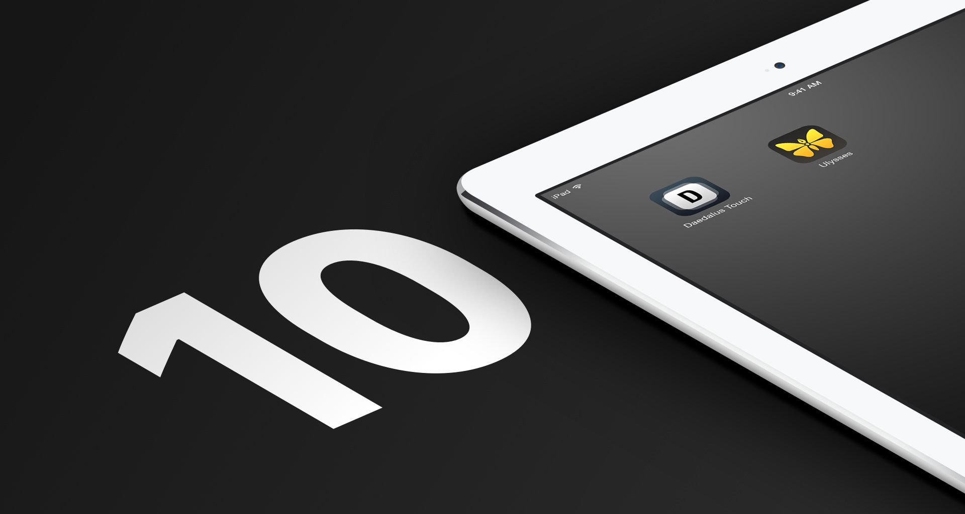
But the iPad felt so right. We wanted to do a writing app for it. We just needed a different concept. A new approach. Not having to bring over the old cruft was definitely freeing though. We wanted go all-in with this new, exciting, gesture-based, real-world-mimicking way of interacting with an app. During the first few weeks of owning an iPad, Marcus came up with this idea of visually working with “stacks” of “sheets”. The idea was to navigate them like you would in the real world: Opening a stack was similar to spreading out its sheets next to each other on your table. Switching between sheets was like turning a page. Of course, there was an unlimited number of sheets, and a new sheet got added for you automatically once you reached the end of the stack. Plus, sheets would not end at the bottom of the screen but could have any length. Navigation and interaction was purely gesture-based: pinch, zoom, drag and swipe, and the UI was non-technical — no lists, no buttons, no disclosure triangles... And it worked! It felt great. We called the app Daedalus Touch. The teaser trailer I made for it at the time gives a sense of how it all came together:
Through Daedalus, the iPad taught us that not everything needed to be organized in hierarchies and folders. It taught us that lists and tables are not necessarily the best way of organization, especially not for creative processes like writing. Daedalus made the case that an app can be really useful even without all bells and whistles. It gave a new essence to an idea we had since the very beginning – a world without files and folders.
We realized that, like a real sheet of paper, a virtual sheet should not need to have a name or a title. Neither should it need to be filed away. In the physical world, you can just take a piece of paper, scribble something onto it and drop it somewhere. Of course you’d never find it again, neither could you search its contents – but that’s what digital tools are there for. Yet in our digital technocracy we had lost a lot of the ease and simplicity of real world things. The iPad made this case boldly, and Daedalus followed suit.
Over the years, however, we started hitting the boundaries of this “lets emulate the real world but make it better” concept. New features became increasingly harder to add as everything had to fit into that one tight metaphor of sheets and stacks. Just to give you an idea: Some users had a lot of stacks, often multiple ones for the same project. They were asking for another layer of organization – and we asked ourselves what that could be? Folders of stacks? Registers? How should they look and feel? Even if we solved that, how would we preserve the elegance and simplicity of the app? We tried to be fancy and smart, but we got stuck with Daedalus, on iPad.
With iPad taking us nowhere, our attention shifted back to the Mac. Motivated by Apple redesigning Mac OS Lion with interface elements from iOS, we started to imagine how a modern Ulysses might look like. And even though we would build it Mac-only at first, we tried to come up with a concept that should also work on iPad, should it one day become capable enough.
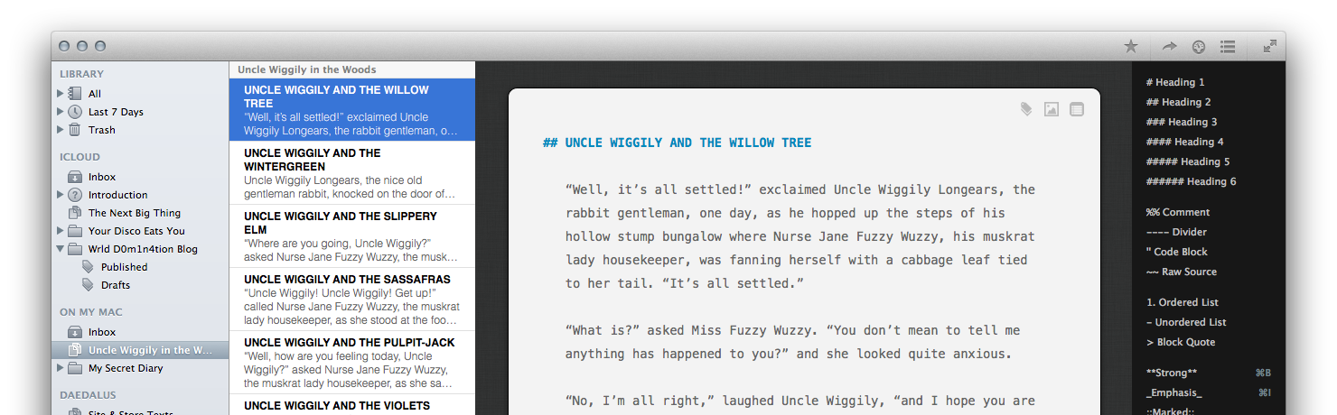
The plan was to build a fusion of the original Ulysses’ vision and ideals, the then-new three-column Mac design, the all-in-one (shoebox) approach of iPad apps, and the sheets from Daedalus. Everything would sync through iCloud, ready for you to pick up writing at any device (well… Mac, at that time). It would have a hierarchical organization with effortlessly organized sheets. No files, but with groups, folders and filters. Our aim was to make powerful app simple to use. To no surprise, this took much longer to build than we had hoped and was way more complicated than we’d ever imagined. But in the end, we shipped Ulysses III:
Funnily enough, only a few months later Apple moved from their textured, real-world interface on iPad (skeuomorphism) to a flat, abstract look. In one big sweep, the era of “realistic” interfaces had come to an end. And we sadly had to realize that Daedalus’ stacks of sheets had failed. On the plus side, we were already one step ahead with the new Ulysses. iOS 7 shipped the new abstract interface design and added technologies which allowed us to bring a fully-featured experience to the iPad. We finally had all that we needed to get going and were quick to draw up a few early sketches of Ulysses for iPad:
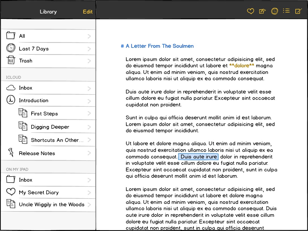
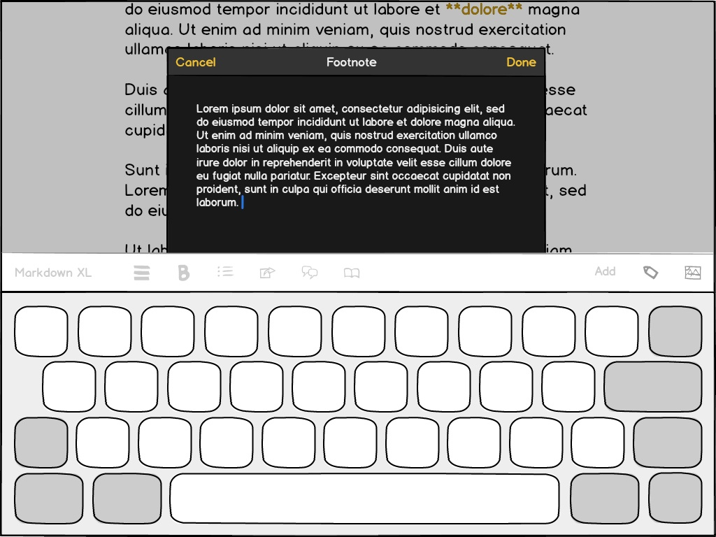
It all seemed pretty straightforward at the time, but it would become yet another challenge. From those sketches, it would take us one and a half years until the app would actually ship. The technology was fine, but not everything that worked on the Mac would also work on iPad. A lot of the interface revolved around detachable mini windows (popovers) that weren’t available on iPad and that we needed to replace. Some features were quite easy to adapt, but some we had to re-imagine. Take the sheet attachments as an example: On Mac, they used to reside in a bar at the top of a sheet. On iPad, we tried a lot of variations, but ultimately had to move them into a new sidebar. Although the change was only needed there, the feature was then so different that we decided to incorporate the new layout on the Mac as well. While we initially thought it would be mostly more consistent, we soon saw that attachments had become much more useful on the desktop as well.
Although this is only just one example, the entire process of bringing our Mac app to iPad went on like this. The limited space on those smaller screens forced us to think and to experiment a lot. We had to keep changing flows, arrangements and complete parts of the UI until they felt right. We thought we had a well-structured and simple concept already, but learned that everything needed to be more structured and even simpler for iPad. The extra rounds were rewarded with many of the revelations also being applied to the Mac, where they made for a simpler, better interface as well. Ulysses on the desktop became better, because we made an iPad version of it.
We thought we had a well-structured and simple concept, but it needed to be more structured and even simpler for iPad.
Interestingly, similar stories could be told about the iPhone version, which we made a year later. The need for simplicity and clarity holds true even more there. I’d like to focus on the iPad’s crucial mediator role in realizing this “super-mobile” version though. When we started working on the iPhone version, the iPhone had already been around for the better part of a decade. Of course we had often talked about how Ulysses might look on it, but never saw how we could fit all the features onto such a small device. If we built a mobile version at all, then as a feature-reduced companion, or so we thought. In fact, we once even had a working prototype of one for the original Ulysses. (That did not play out for technical reasons.) It wasn’t until we had Ulysses running on iPad, that we realized we wouldn’t have to compromise. Before that we could just not imagine how that would ever work. Seeing it and working with it in practice on the iPad made it obvious that the full Ulysses on iPhone would, in fact, work.
This post here was written, reviewed and edited on a Mac, an iPad and an iPhone. A huge part of this unified experience is thanks to the iPad. Given how much has changed over the past ten years, I can’t wait to see what technology will look like after the next ten.
PS: It happens that today, April 3rd, is also Ulysses III’s eighth birthday! 🥳 Here’s to the next year, dear friend. It’s definitely going to be exciting…