
This is the first part of a series of posts on the final Ulysses 3 user interface. We hope that these will get you over the next couple of weeks. ;)
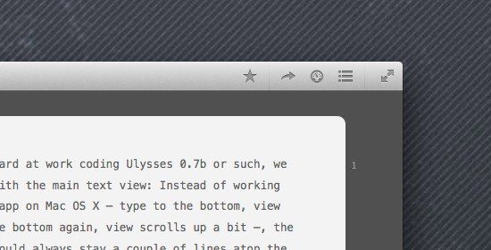
The above shot is Ulysses’ window chrome. Yes, all of it. There are the obligatory OS X window buttons, of course, but apart from these: That’s it. These four buttons (fullscreen doesn’t count) are the result of 14 months hard work, heated debate, sleepless nights and numberless mockups, revisions and rewrites.
They may not seem like much, but this is what design is all about: Make it not seem like much. And to me, us, these four buttons resemble everything Ulysses 3 is in terms of user interface and interaction: Focus. Scalability.
We will reveal more of that in the coming posts, but the general theme is adaptiveness. For example, the initial view of Ulysses will pretty much resemble a simple note pad, and you can use it as such. But once you’re done submitting your third novel, you will have grown the app into a fully-fledged text editing power house. Yes, you.
It’s all there from the get go, of course, easily discoverable, but we won’t rub it in your face, and you won’t have to use or even see any of the app’s advanced capabilities. You may add notes and keywords to your texts, but if you don’t, there won’t be empty spaces nagging you to do so.
This is a vastly different approach than our current offering, where we tried to create a highly optimized interface that offered every option upfront, while at the same time feeling not too crammed (well, hopefully). It was a formula well suited for the time, and as such was quickly adopted and built upon by various other outlets.
But times have changed, and expectations have shifted.
So back to the buttons. They are, from left to right: Favorites, Quick Export, Statistics, Navigator. Clicking these buttons will each produce a popover, which can be torn-off and thus turned into a HUD window.
The contents of three of these windows will update according to the contents of the editor, so they will always relate to what you’re currently looking at. In tight spaces, on small screens, they are ever only a single click or shortcut away, while they can just as easily be placed on a second monitor.
We’re confident that this approach is not only more flexible, but once again far superior to anything currently available — on any platform. Whether you’ll use Ulysses 3 to write novels or blog posts, or whether you’ll just use it as your personal diary, you can do so with just as much options as you currently need.
To be continued…