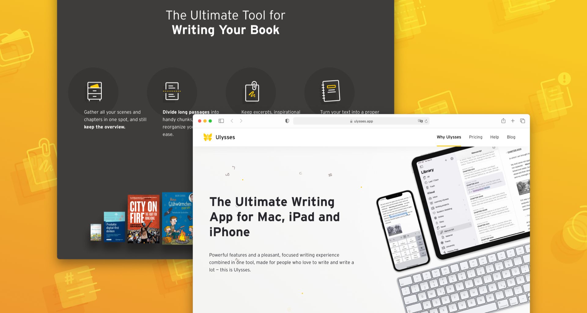
Have you noticed that the Ulysses website looks different? A new, mainly monochrome design with a yellow accent color centers Ulysses’ particular strengths and underlines our intention to focus on the essential.
We haven’t been satisfied with our website for some time now, and we’ve made a few attempts to change it. Unfortunately, we had put our plans on hold more than once due to a clash between resources (limited) and expectations (too high). As app makers, our primary focus is always on the product: conceive and develop new features, adjust the app to new systems, solve problems and fix bugs. We had grandiose ideas for the website, including elaborate animation effects, illustrations and all kinds of bells and whistles. However, the resources we could realistically allocate were not enough to realize these — we learned that the hard way.
That’s why we’re even happier that we finally succeeded! We had to pare the website overhaul down to the essentials, and it still took us longer than expected, but there it is:
- The appearance is finally consistent with the style guide we’ve used for redesigning our Styles & Themes website and the Ulysses blog. The theme is monochrome with black, white and grayscale colors, combined with a yellow accent derived from the Ulysses icon, and underlines our intention to focus on the essential.
- More than ever, our landing page is centered on Ulysses’ particular strengths and their visualization. Finally, the built-in grammar and style check gets the attention it deserves. Also, we aim to better underscore how Ulysses can help with particular challenges in the writing process.
- As we’re particularly proud of the great people who use Ulysses — novelists, nonfiction writers, bloggers, journalists, founders, TV presenters, content strategists — and what they achieve with it, the new landing page exhibits user stories and works written in Ulysses.
- In general, we tightened the informational structure, removed redundant content and made everything much more clear and concise.
- Last but not least, the underlying architecture is now much more robust and maintenance-friendly. As a result, future changes will be easier to implement. Also, we improved the site’s performance, which should reduce load time.
There are, of course, rough edges here and there and things we’d like to improve further. By and large, however, we’re happy with the result. So what do you think about the new website? We’d love to hear your thoughts!