We released Ulysses 12.1 for iOS today. It should already be available on the App Store, so go grab it, it’s one hell of an update.
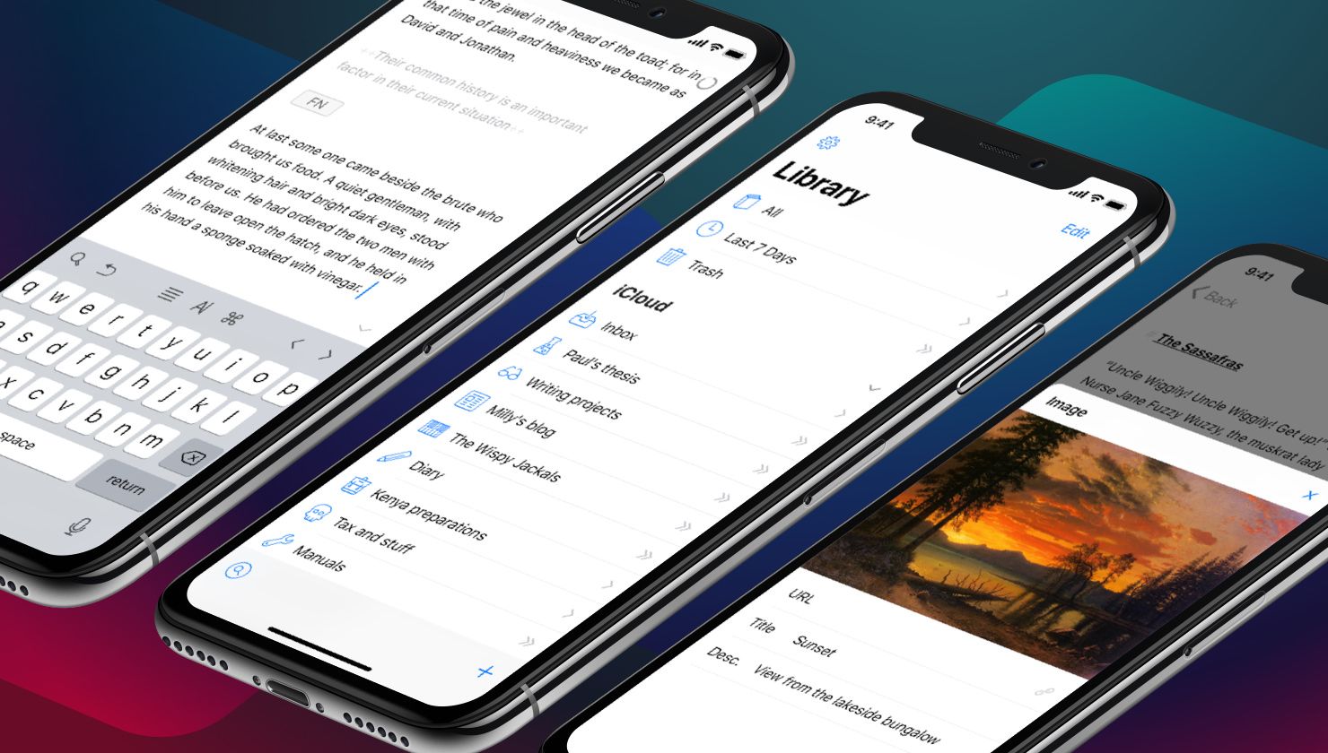
The headline feature may be full support for iPhone X, and yes, we love how it looks on Apple’s latest, but we had already done the main part with v12, so let’s not spend too much time on that.
It’s ready for iPhone X, Face ID and all, so go play with it and have fun (the device rocks hard, we know, so go, go, go)!
But…
Revised Object Editors
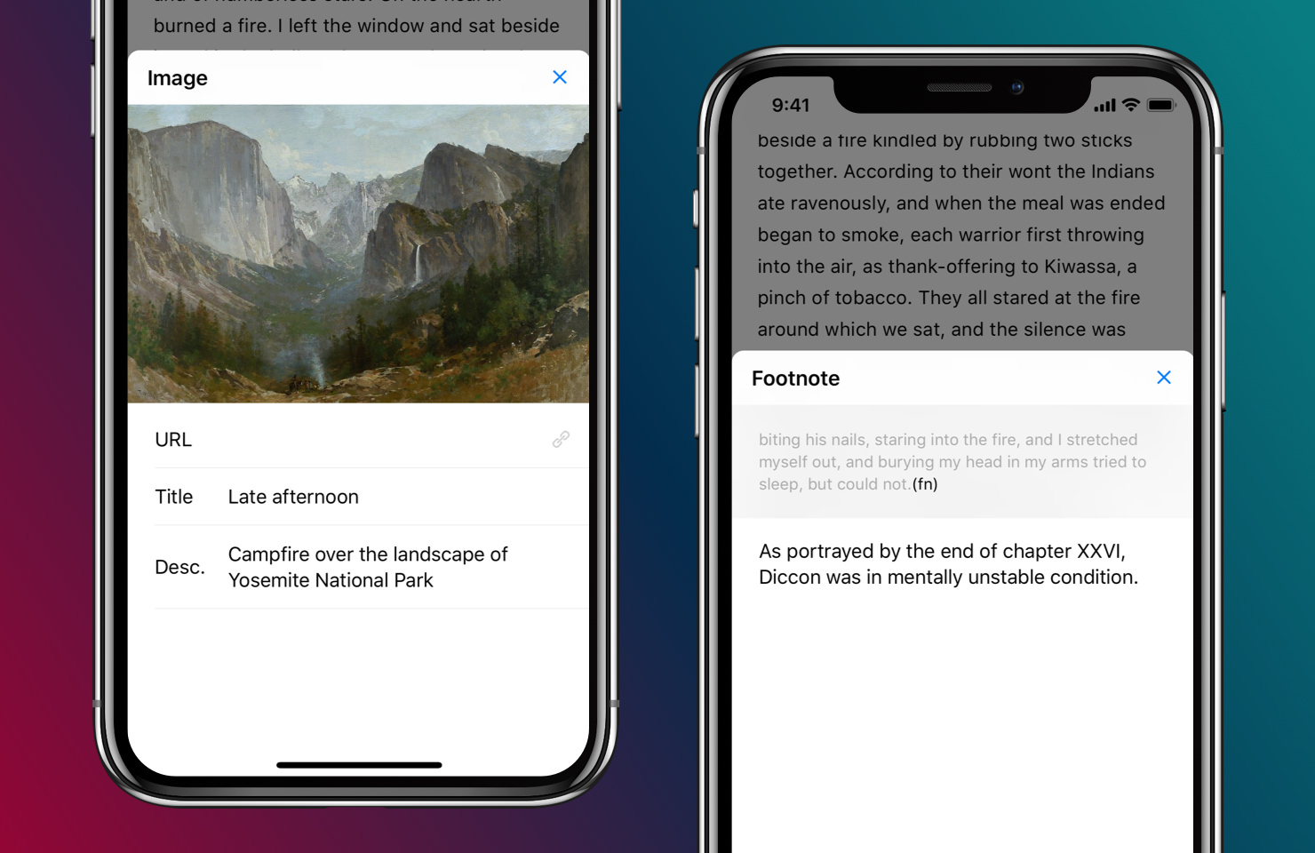
We have completely reworked the look and feel of our object editors, i.e. the way links, images and footnotes are presented. For starters, a single tap now opens all corresponding views, which will take a minute or so of getting used to, but then you’ll never want to go back.

On iPhone, we now present images etc. via a slide over from the bottom, while on iPad we have thrown out all the slide-up stuff and now present objects within a nice popover. For image objects, we have added single-tap for QuickLook and a swipe to replace or delete the current image. For footnotes, links and annotations, we now present the context within the overlay, something that inspired the previous method, but it’s so much better now.
We have also improved all the various interactions with or without the on-screen keyboard. It’s all a lot cleaner, clearer, and a lot faster too.
A New Theme
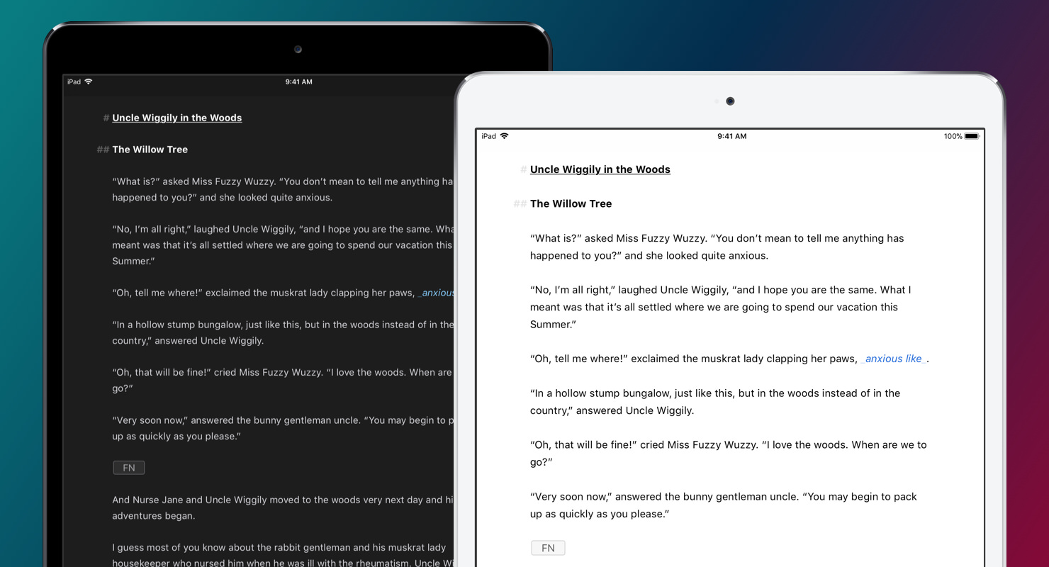
Hot off the heels of the visual update we gave you with v12 comes our new default theme, simply named D12. Up until now, all our default themes were built around color and providing strong differentiation for the various markup options. Headlines were colored, strong had a different hue from emphasis, and images, footnotes etc. were all given a distinctive accent. It made it very easy to scan your text, and looking at themes on the Style Exchange, it’s an approach that has a lot of followers.
But with iOS’ recent move to a — quite literally — bolder visual structure, we felt it was time to adapt and offer something fresh, and more in tune to how the app now looks and feels as a whole.

The result is a very simple theme, with high contrast, a focus on typography, and a rather streamlined use of color. We love it a lot (and it looks awesome on iPad with Courier Prime, for example), and we hope you’ll like it, too.
D12 will also be available in a modified version for Mac with the next update, and it will be our main theme going forward, screenshots and all.
That’s it for now, please make sure to check out the full release notes, to see what has changed above and beyond the topics discussed here.
And now, as always: Have fun writing! Let us know how it goes.
