Here’s a story: When we set out to reboot Ulysses, we wanted to make it “easier”. You know, like in “de-complicate things”. We felt that we had created this very sophisticated piece of software, very powerful, but with a rather steep learning curve and with a lot of in-your-face complexity.
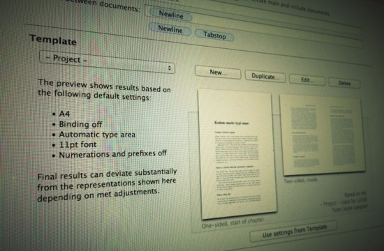
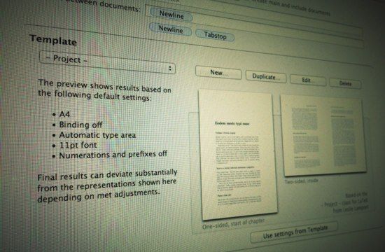
Take the Exporter as an example: Here’s all this stuff you can tweak and set and prefer and switch amongst or decide against, and while that’s pretty awesome, all you really want to do at the end of the day is output your stuff as a PDF.
Or take metadata for your documents: Status, label, timestamp, tags/keywords, excerpt, notes — it’s great to have these available at your fingertips, but they add quite a lot of overhead if left unused, just sitting there. Plus, they seem to enforce a certain working style, in that any sort of empty metadata looks and feels like an oversight. No status, no label? Whuddat?
So during the course of the past several months, we simplified a LOT. So much at times, that we had to backtrack in order to keep the available options visible. See, there’s this one sketch, from early on in the development process, which just shows two buttons: Write. Publish. But then Max said we should at least add some preferences, so we went back to the drawing board…
The result is an app that shares the same underlying complexity of Ulysses 2, but looks more like a simple notepad. And while it looks slimmed-down, it’s really beefed-up.
We added inline images, links, footnotes. We added inline-video wich translates to valid HTML5 upon output. We added a nice tagging/keyword system and full support for multiple, differing markups. We even created a new search interface, which we believe is unparalleled in current word processors — not only for its usefulness and ease of use, but for its hardcore transparency.
Yet there are no tabs, no note- or info panels. There’s no preview, no collection browser, no full-window interface for Search & Replace. Preferences are down to three views, with the main options being limited to font style and choice of insertion point. We even condensed the toolbar down to seven buttons, and that includes the traffic lights AND fullscreen. And we killed the filter field.
So what we have now, is a very streamlined, but at the same time very adaptive application. Instead of offering everything upfront, it will just grow with your needs, and it will do so gracefully. And believe it or not, Ulysses 3 will look far less complex than your average Twitter app.
I would love to show a screenshot, but I’m afraid you’ll have to wait a few more weeks. Patience is a virtue, but you knew that. ;)
