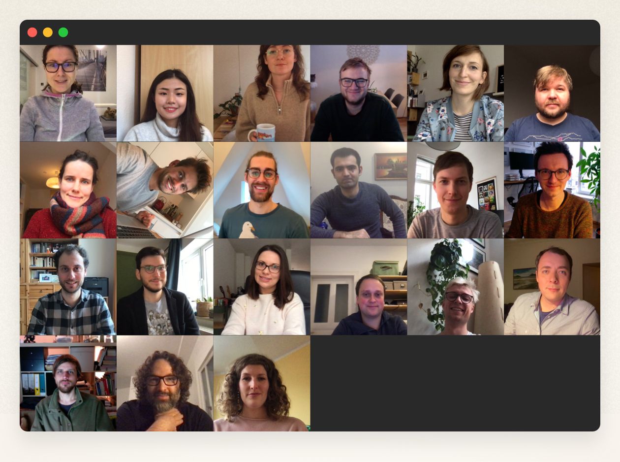
2020 was a year unlike any other. In terms of physical events, it will be remembered for all the things that didn’t happen. Usually, we send selected developers to California to Apple’s World Wide Developers Conference. Usually, we travel to the German Mac developer’s conference Macoun for a mixture of new input, networking, and hanging around. Usually, there is a summer party and a company Christmas party — well, there was a Christmas party. It was virtual, like most of the collaboration in the company in 2020.
In fact, remote companies are not uncommon in our industry, but Ulysses so far stuck with the “office principle”: quick clarifications over the desk, live meetings, and chitchat at the coffee machine. In 2020, this changed. The office is almost empty, meetings are only virtual. Most employees work from home, which can be as far away as Barcelona and Tashkent (in most cases, it’s still Leipzig, where we’re based in Germany). Working remotely wasn’t our plan, and we still want office life back. However, last year we realized: we can do it. We can be productive even if we don’t see each other every day, and some of us struggle with additional challenges (child care, homeschooling, you feel me, don’t you?). It’s true, our hurdles were smaller than those of less digital companies, but we’re still a bit proud of ourselves.
In 2020, we published three big (Ulysses 19, Ulysses 20 and Ulysses 21) and nine small releases, whereupon Ulysses 21 was actually two releases. The versions for Mac and iOS should have been published simultaneously to bring Ulysses up to speed with the new Apple’s OSes, but, to our surprise, Big Sur was only released in November, two months after iOS 14.
Here are what we consider the most important changes and improvements with Ulysses in 2020, also beyond our product releases. If you would like to know in detail which feature was introduced with which new version, you can check out the complete history here.
The Dashboard
With the dashboard, we introduced a new element to Ulysses’ interface, which gathers a number of powerful features in a central spot, improving their accessibility and usability. Take a look at our introductory video below; it offers a great overview of the things you can do with the dashboard.
Grammar & Style Check
Since 2020 you no longer need an external tool for checking your text’s accuracy, grammar and style! Ulysses now has a comprehensive solution built-in, which offers suggestions for improving your text in many different categories. Best of all, it is available in 20 different languages.
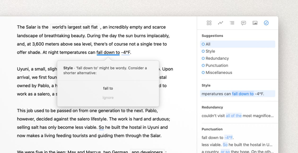
Read more about Ulysses’ grammar and style check in our tutorial.
Revision Mode
The grammar and style check is part of a dedicated revision mode we added to Ulysses in 2020. In this particular mode, not only can you review the text check’s suggestions but you can also review your own comments and annotations. Revision mode comes with a special color scheme, where general markup is toned down, whereby comments and suggestions are highlighted. Watch the following video for an overview of its features.
Outline Navigation
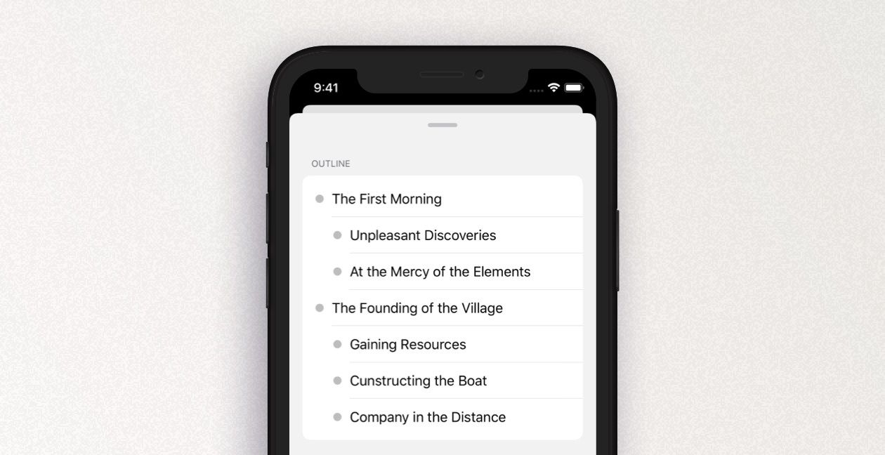
The navigation now can also be found in the dashboard and has gained more functionality. It is really handy for working with large documents. The outline displays not only your headlines in a hierarchical order but also links, footnotes, images and other text elements, and allows you to quickly navigate to their respective spot in the text.
Ready for iOS 14
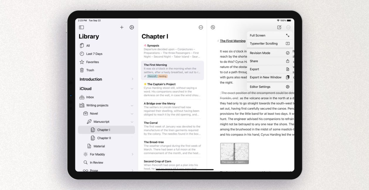
If you’ve followed us for a while, you’re aware of the huge emphasis we put on adapting new UI concepts and OS changes for Ulysses, making the app fit in naturally. The new iPadOS in particular has motivated us to streamline menus and navigation with iOS 14. In our opinion, Ulysses on iPad is now even better to use, and we hope you think so, too.
Ready for macOS Big Sur
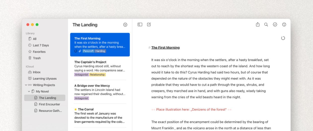
Apple’s new Mac operating system macOS Big Sur, which was finally released in November, necessitated comprehensive changes. On the one hand, we reworked the whole app to adapt Ulysses to the new look and feel. Big Sur’s design language is clear, light, unintrusive and generously spaced — a perfect match with our own design philosophy.
On the other hand, the Mac app received a new icon, which was derived from the iOS icon. With its squared form and the impression of spatial depth added to the Ulysses butterfly, the new Mac icon accounts for the design standards under Big Sur. At the same time, Ulysses is now easier to recognize when switching between platforms. This highlights our idea of Ulysses as one unified writing tool, no matter if used on Mac, iPad, or iPhone.
Material Sheets
Not everything that you write is meant to become part of a text’s final version, think of research notes, character descriptions, synopses. We introduced a particular type of sheet to distinguish this stuff from your actual text. Material sheets will be stripped out during export; their content will not be counted for text statistics and calculating a writing goal’s progress.
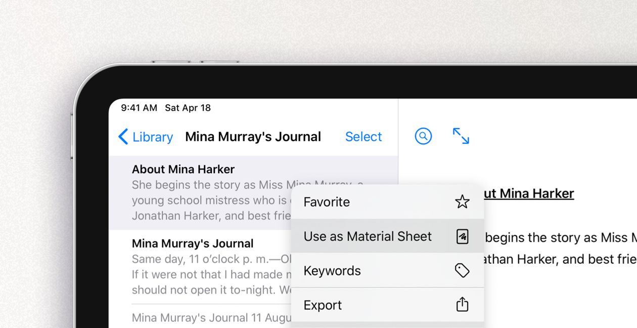
For more information about material sheets, head to the Sheet and Groups tutorial.
Mouse and Trackpad Support on iPad
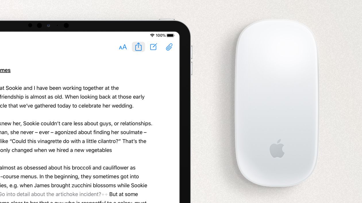
We’re fans of the iPad as a stand-alone, fully-fledged working machine. That’s why we make an effort to keep Ulysses’ iPad version on par with the Mac version, feature-wise, and that’s why we followed suit when Apple started offering mouse or trackpad support. There’s no further explanation necessary; try it out!
Family Sharing Support
This one does not increase the functionality of the app but the number of people that can use it, which is, as we believe, also a good thing! A couple of weeks ago, Apple made Family Sharing available for subscription apps, and we were among the first to implement it!

Read on here to find out how you can let your loved ones benefit from your writing app of choice.
The New Blog
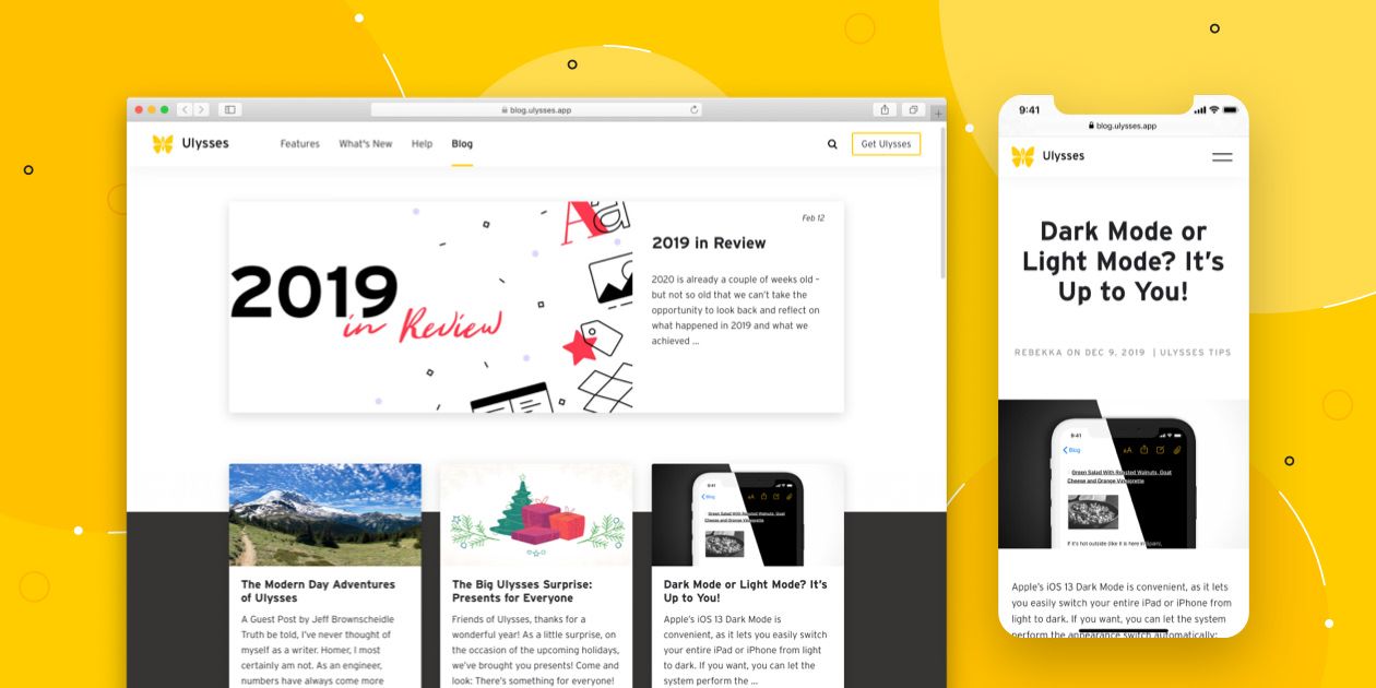
Obviously, this is not about the app itself, and the people involved in the creation of the new blog were not the same ones responsible for the new features. However, we’re so happy with the fact that it’s still in the top ten. We moved our blog to a new platform, gave it a new structure and a new design. It is now much more fun to publish on the blog – we hope it’s fun to read, too! Feel free to browse around and get some inspiration, e.g., through the interviews with TV host Ralph Caspers and Startup founder Rebekah Bastian, the writing tips of publisher Scott Pack, and the numerous tips on making the most of Ulysses!
A High-Five to Our Support Team 🙌
Ulysses’ great customer support team deserves a special mention in this overview. Their work takes place outside of the public focus, but its importance to the success of the endeavor can’t be underestimated. They patiently explain Ulysses, receive feature requests, answer tricky questions and keep their nerves. Thanks, you’re the best!
Customer support was superb: not only did I get immediate help with my request but advice and guidance from someone who was passionate about the app.
New Team Members
Here’s what changed in 2020 in the Ulysses team:
Chaofan entered the team as a replacement for Jingya during her parental leave. She’s registered for German studies at the University of Leipzig. Her responsibility with Ulysses is PR and marketing for China: She translates blog posts and help articles, answers requests from journalists and customers, conducts interviews and maintains the Ulysses profile on Weibo, a Chinese social network similar to Facebook.
Unfortunately, Marcus K. has left the team to set out to new professional endeavors. Good luck; it was a pleasure! Luckily, Max M. came on board as a new web developer and ruler over servers and internal tools. (No, sharing the first name with one of the founders doesn’t help in the job interview, it’s a mere coincidence.) Max taught himself how to code during his studies in theology. After having finished university, he entered professional web development instead of becoming a pastor.
New to the app development team is Sebastian. Holding a master's degree in computer science, Sebastian gathered nine years of experience in development for a popular e-commerce platform for customizable T-shirts, which is based in Leipzig. The thing he loves about coding is that, with only giving some thought, he’s able to create something of value for other people.
Robert came on board as an interface designer, that is, he comes up with ideas about what new features should look and feel like and how they should fit in with the app’s overall concept. Before Robert joined the team, cofounder Marcus basically did this on his own. As a child, Robert dreamed of designing for automotive – today, he doesn’t even own a car and prefers to go by bike.
Last but not least, Diana joined the team to replace Kristin during her forthcoming parental leave. After having finished her master's in communication & media studies, Diana worked with a highway expansion project and with the German chamber of commerce. As an administrative assistant, she now supports Max and the team with all kinds of organizational tasks, from accounting to office management.

To 2021
So, that was Ulysses’ 2020!
Here’s to you, our users, without whom all of this would not be possible. Thanks for your loyalty and your encouraging feedback — please keep it coming! We pray that 2021 becomes a more average year in all the positive senses of the word. We hope that Ulysses was a reliable and useful writing companion for you in 2020, and we’re about 100% sure that it will become even better in 2021. Please follow along.
